Crafting an international festival identity.
SIFA 2016: Potentialities.
Where do I begin?
Do you know the feeling you have when you know something is quite thrilling and yet, for the life of you can't express it in words or visuals? That’s what happened when SIFA 2016 creative brief landed on my desk. The theme was "Potentialities." Rather abstract, I thought to myself.
Stuck for ideas
According to Festival Director Ong Keng Sen, he described it as “the possession of latent power or capacity capable of coming into being or action. It is an optimism that looks to the future rather than at the grimness of the present.”
The objective was clear: an unpredictable festival identity, to attract new audiences and position the festival as a must-attend cultural experience.
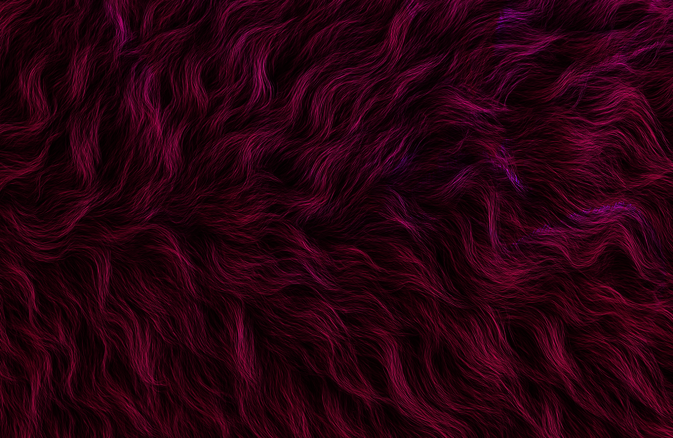
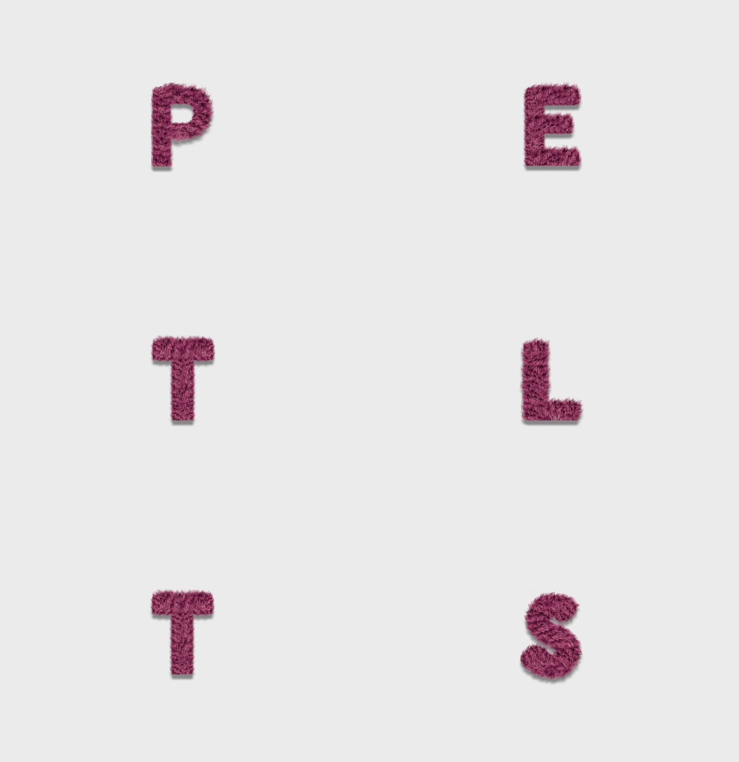
I started by collecting references of abstract art and analysing the form, shape, and texture in the artwork. I was particularly fond of faux fur and liked the idea of creating playful typefaces from its bristling, tactile quality. Colour and texture were elements I considered carefully when crafting the festival identity. The identity had to embody the festival's colour palette, while the choice of tactile quality became a huge feature to express and suggest the abstract theme.
Time to raise the curtain
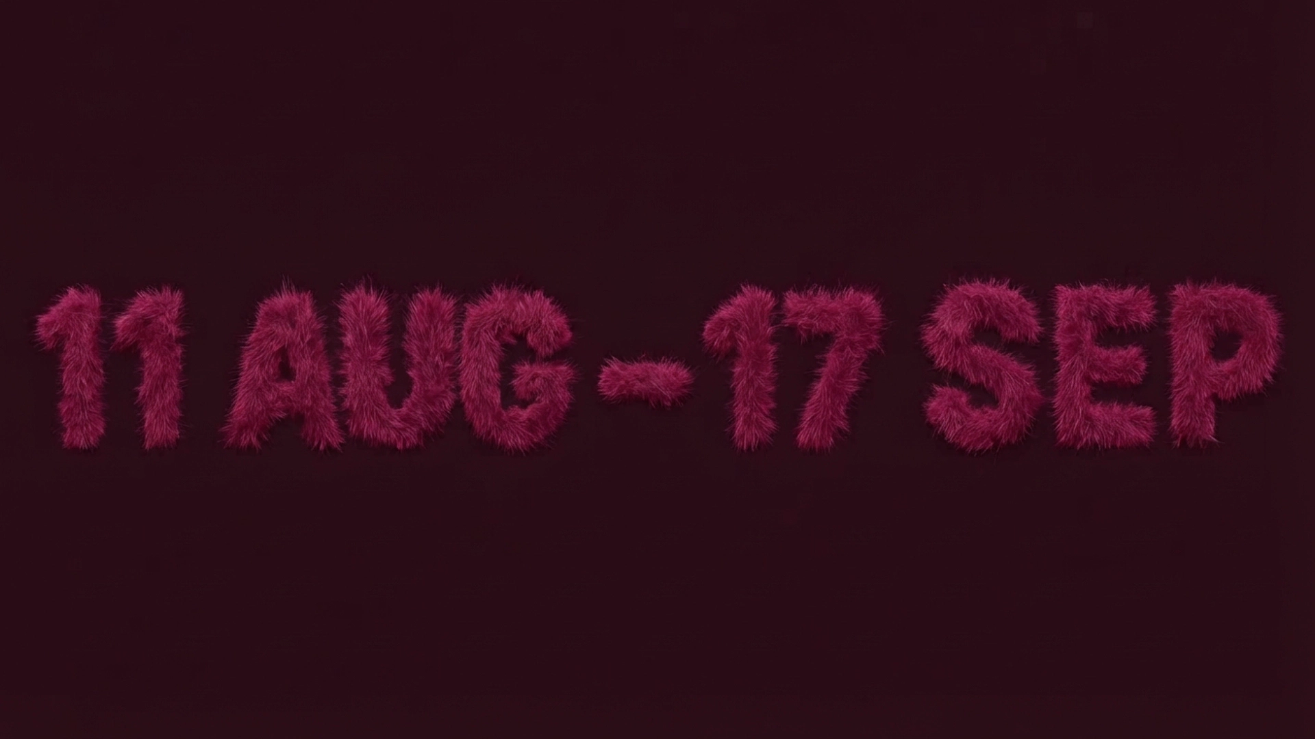
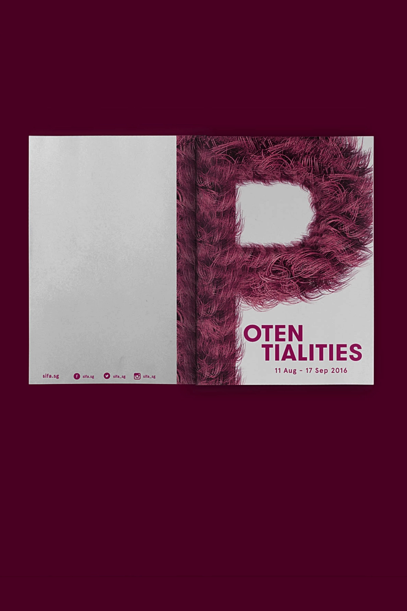
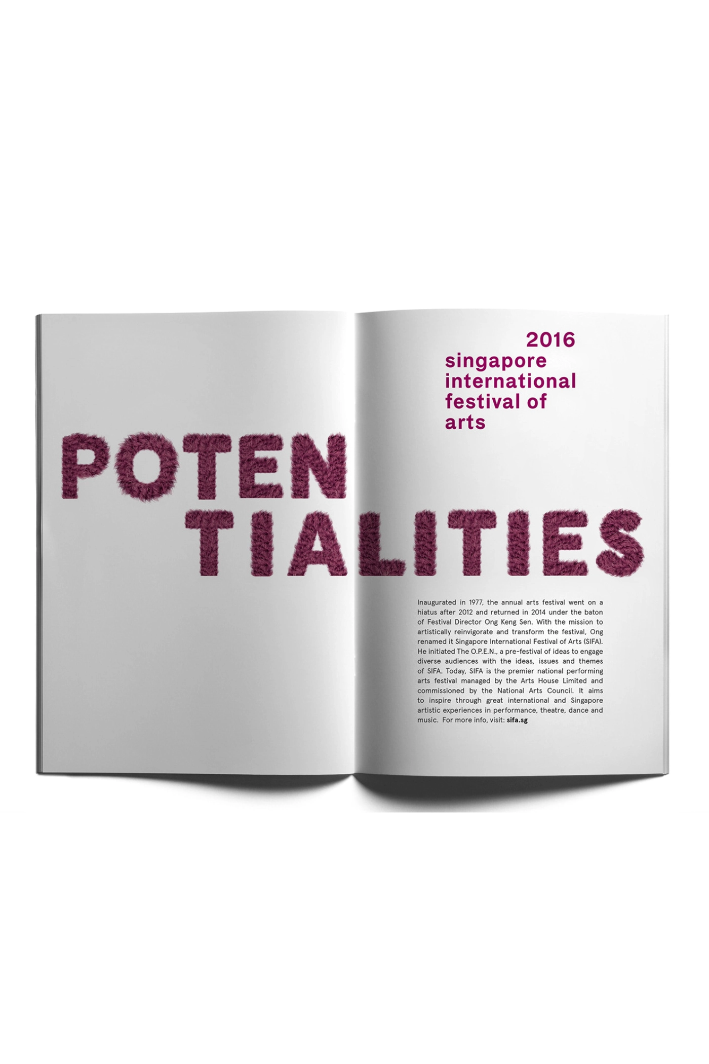
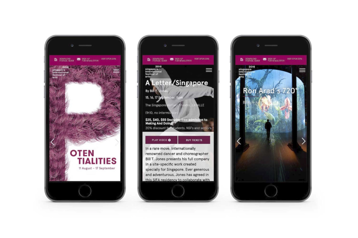
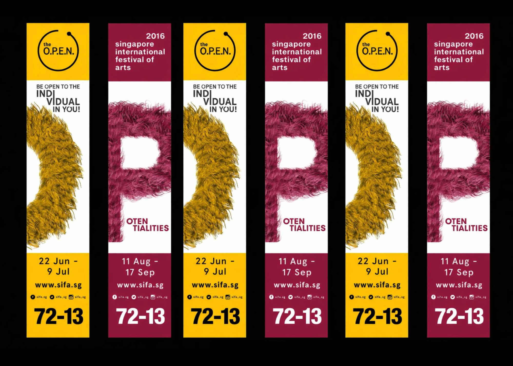
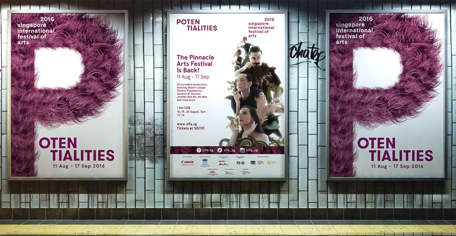
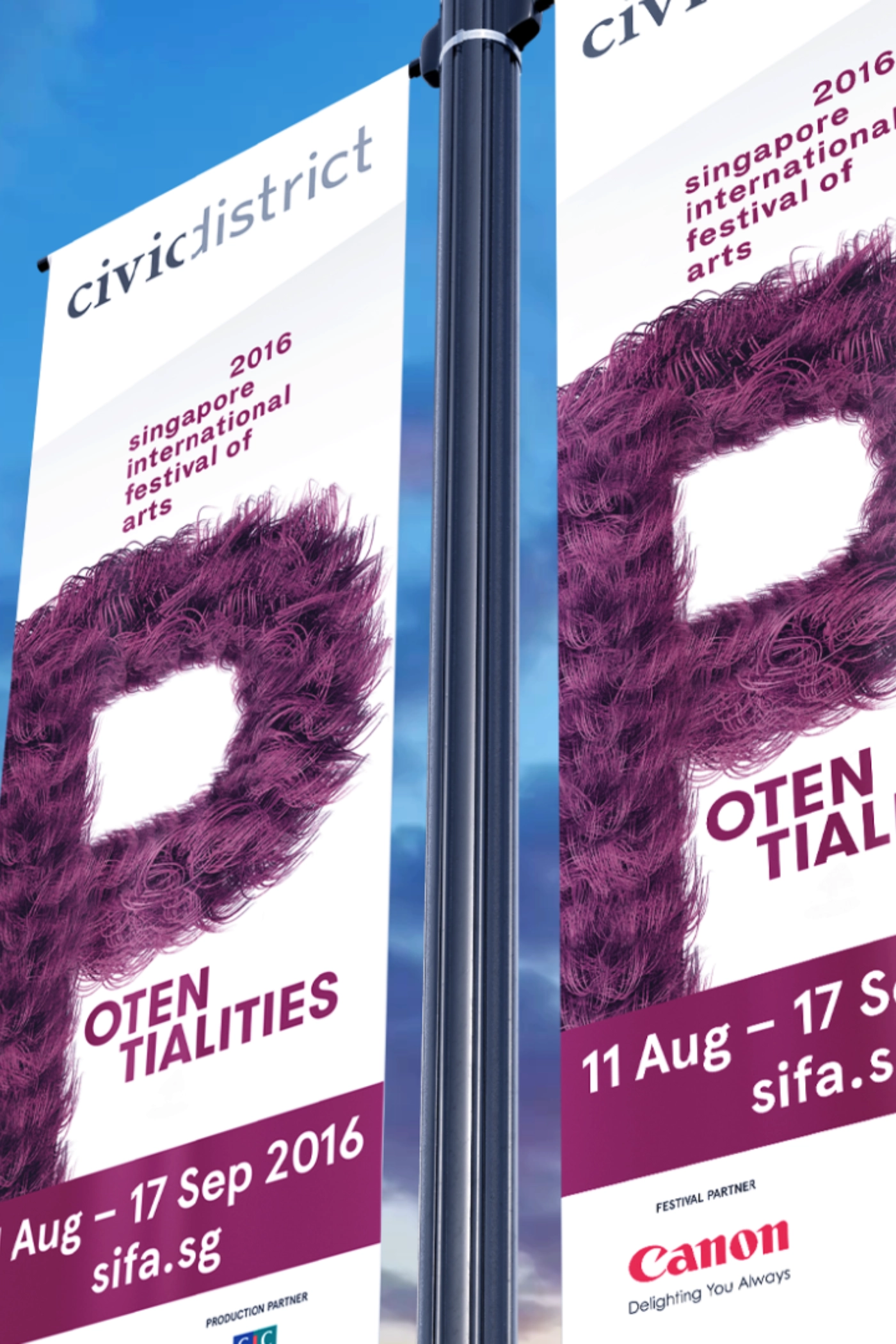
We created customised furry typography - starting with the letter P, a prominent identity used to express and suggest the abstract theme. Bold, strange, and tactile, it felt like it was pulsing right on the poster.
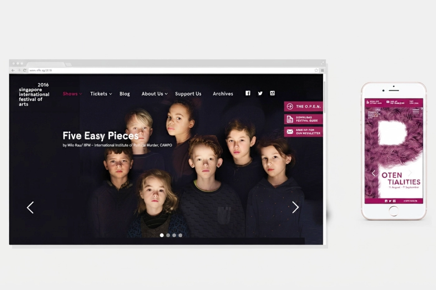
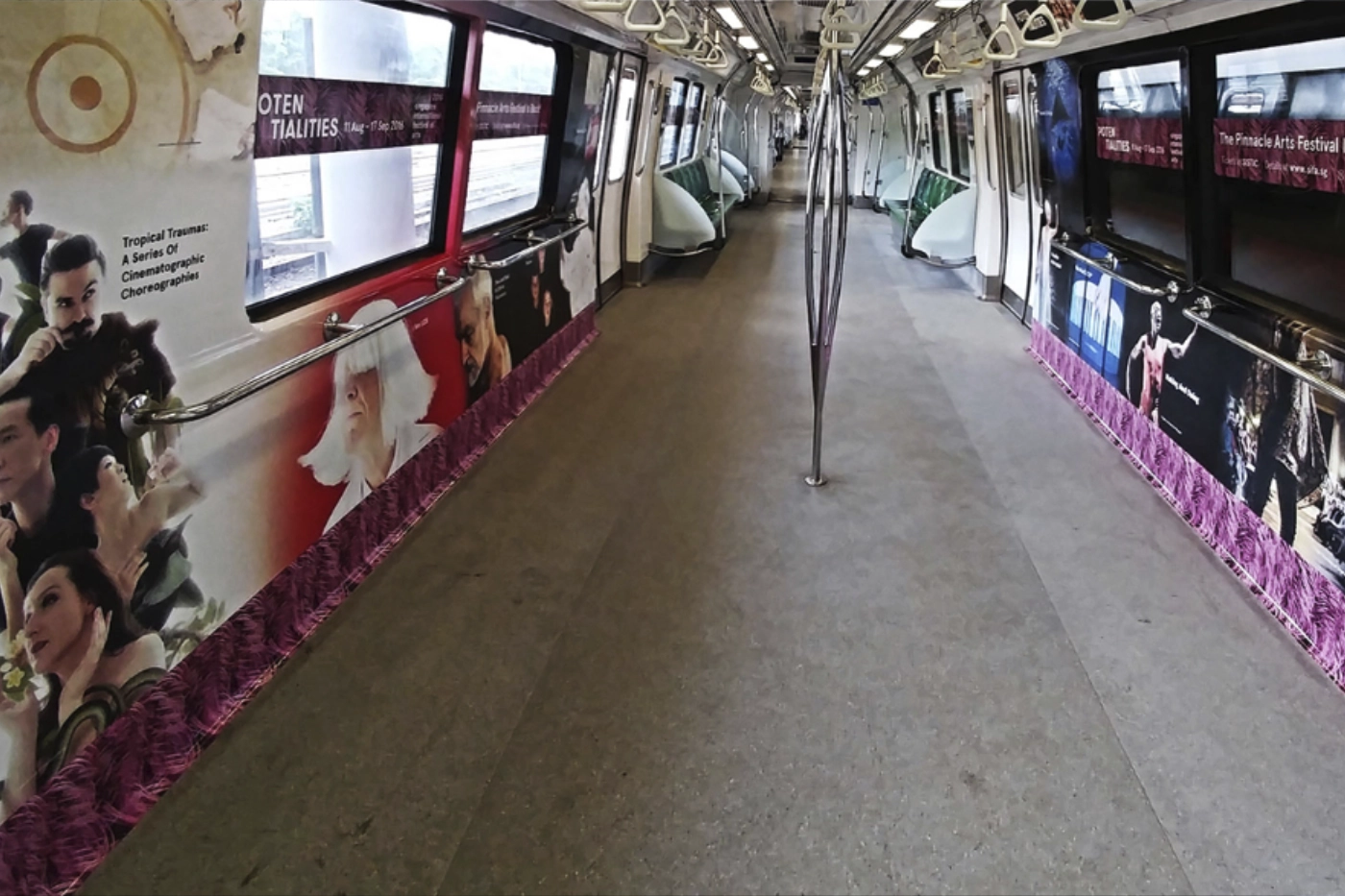
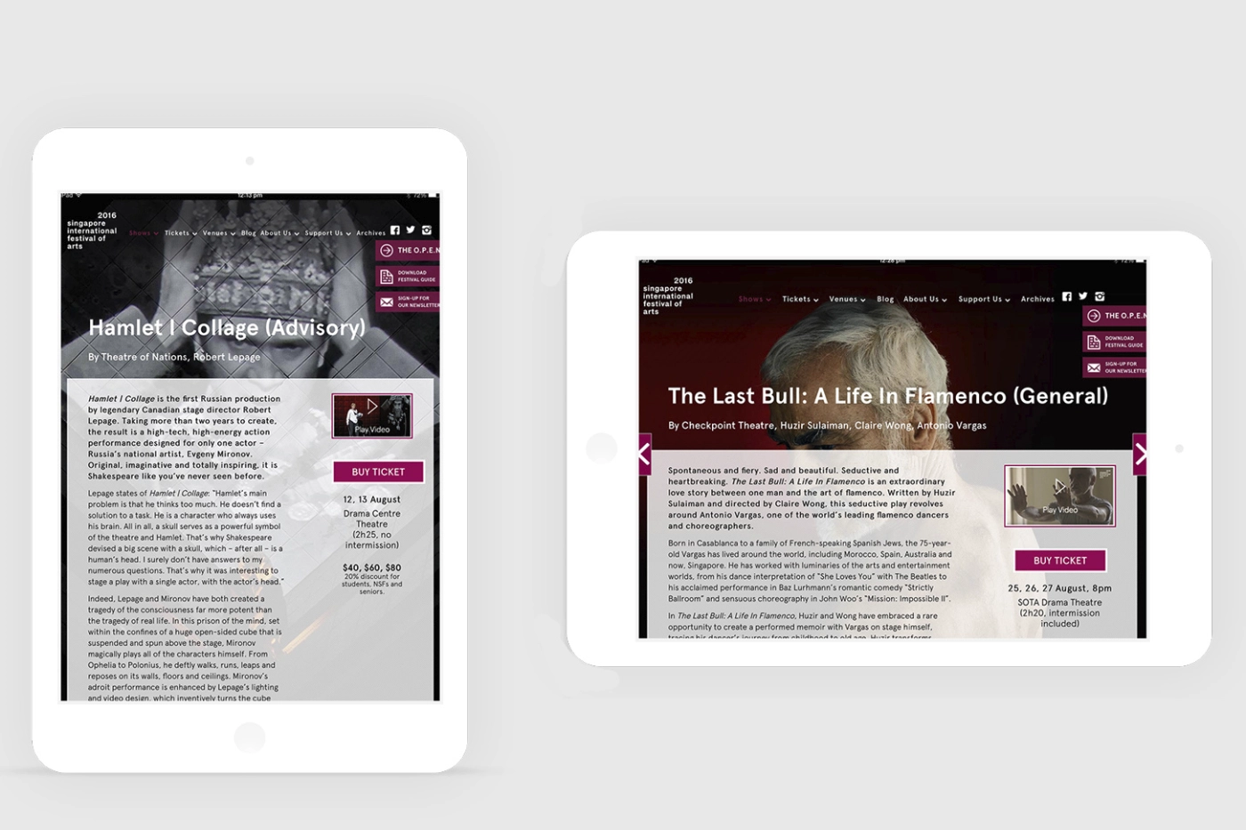
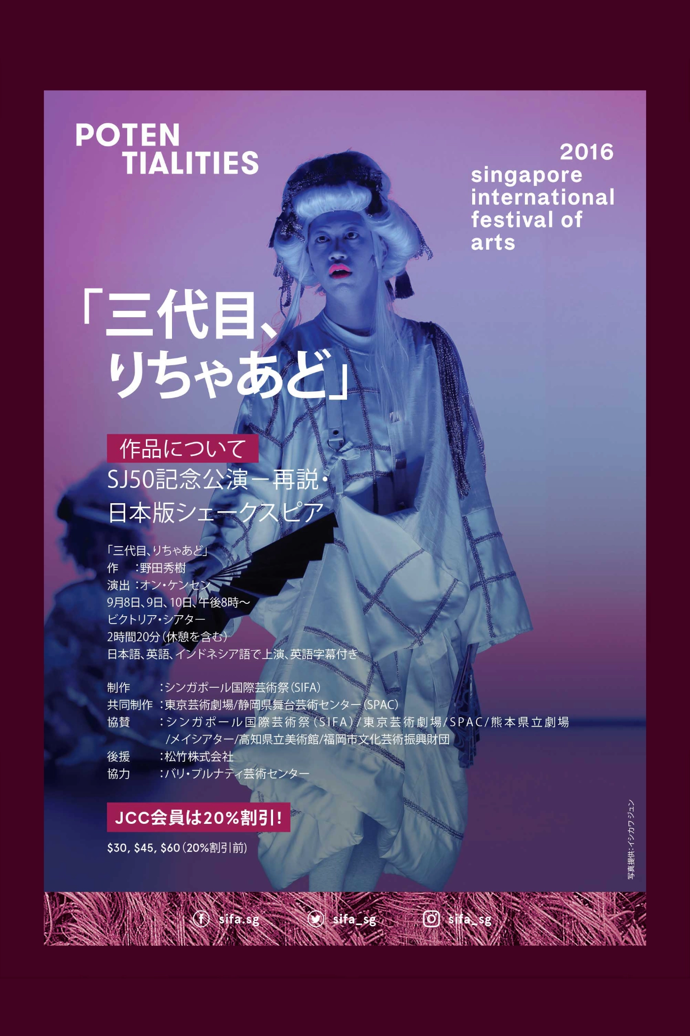
Close-up fur textures became the visual language for the festival branding, creating consistency across all touchpoints. Once we put the identity out, the responses were varied. Was it fur? What am I looking at? Human hair? Or a character from Sesame Street? We love them all. I wanted the identity to evoke a sense of curiosity and direct them to the SIFA 2016 website.
Revamped festival was widely heralded in the press, and attendance increased dramatically reaching a record 155,000 in 2016. All the possibilities. The Potentialities.