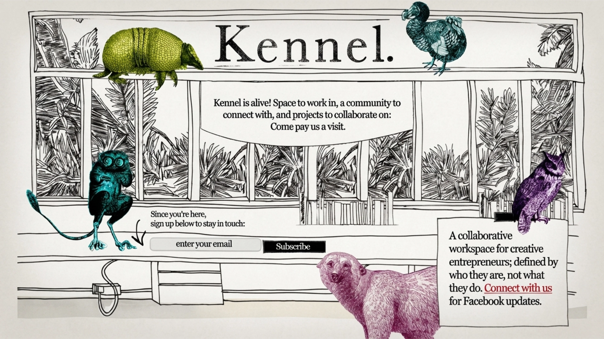
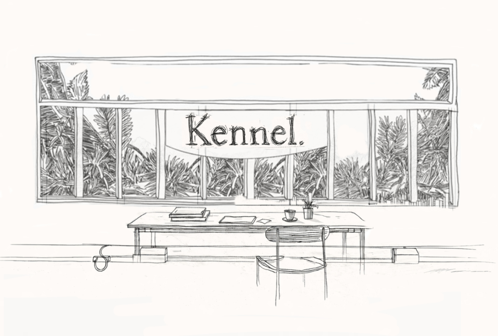
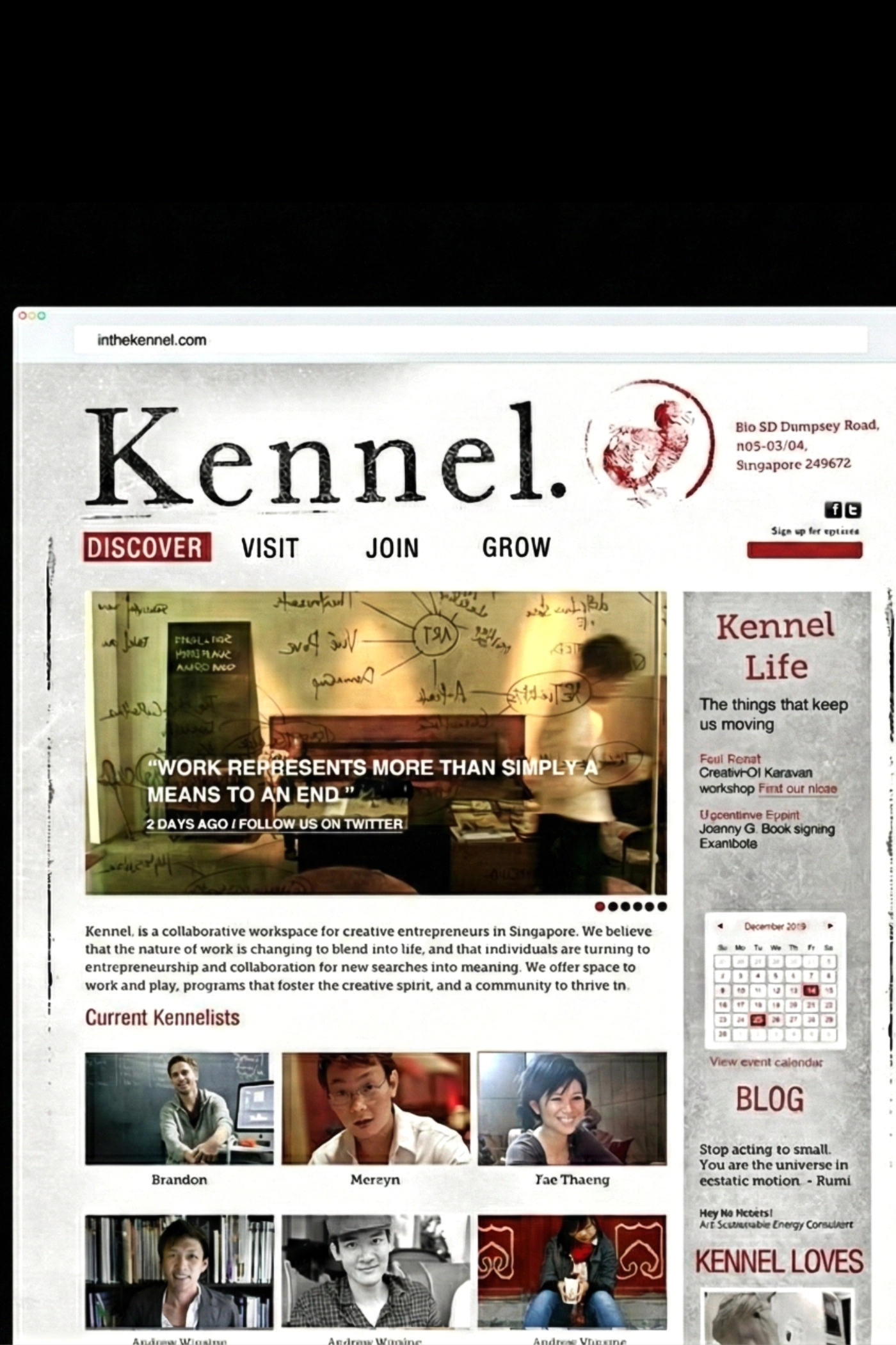
Branding a creative co-working space, KENNEL @Dempsey
There are certain projects that stay with you. Not necessarily because they are grand or have generous budgets, but because something about them resonates — the unusual ask of the creative brief, the mindsets of the founders, or simply the way everything comes together.
When I met the creative minds behind kennel- an architect, design director and filmmaker and a creative entrepreneur, there was something really special about it right away.
.Hands on approach
At first glance, the lush greenery of Dempsey Hill and its charming military barracks seem an unlikely location for a co-working space.
Yet here, space and place come together naturally — close enough to the city, but tucked away in a quieter unexpected setting for makers, thinkers and creative founders to create, connect and grow.
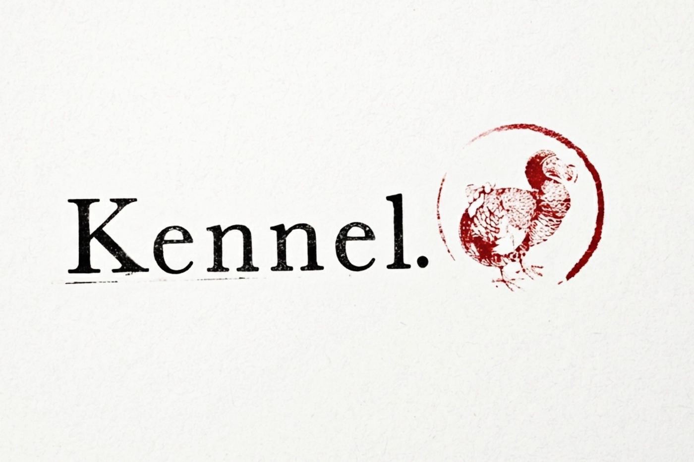
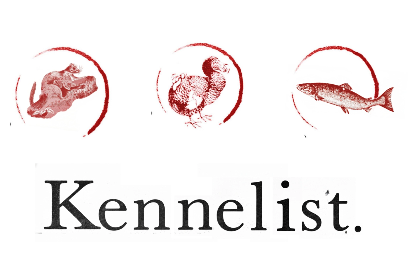
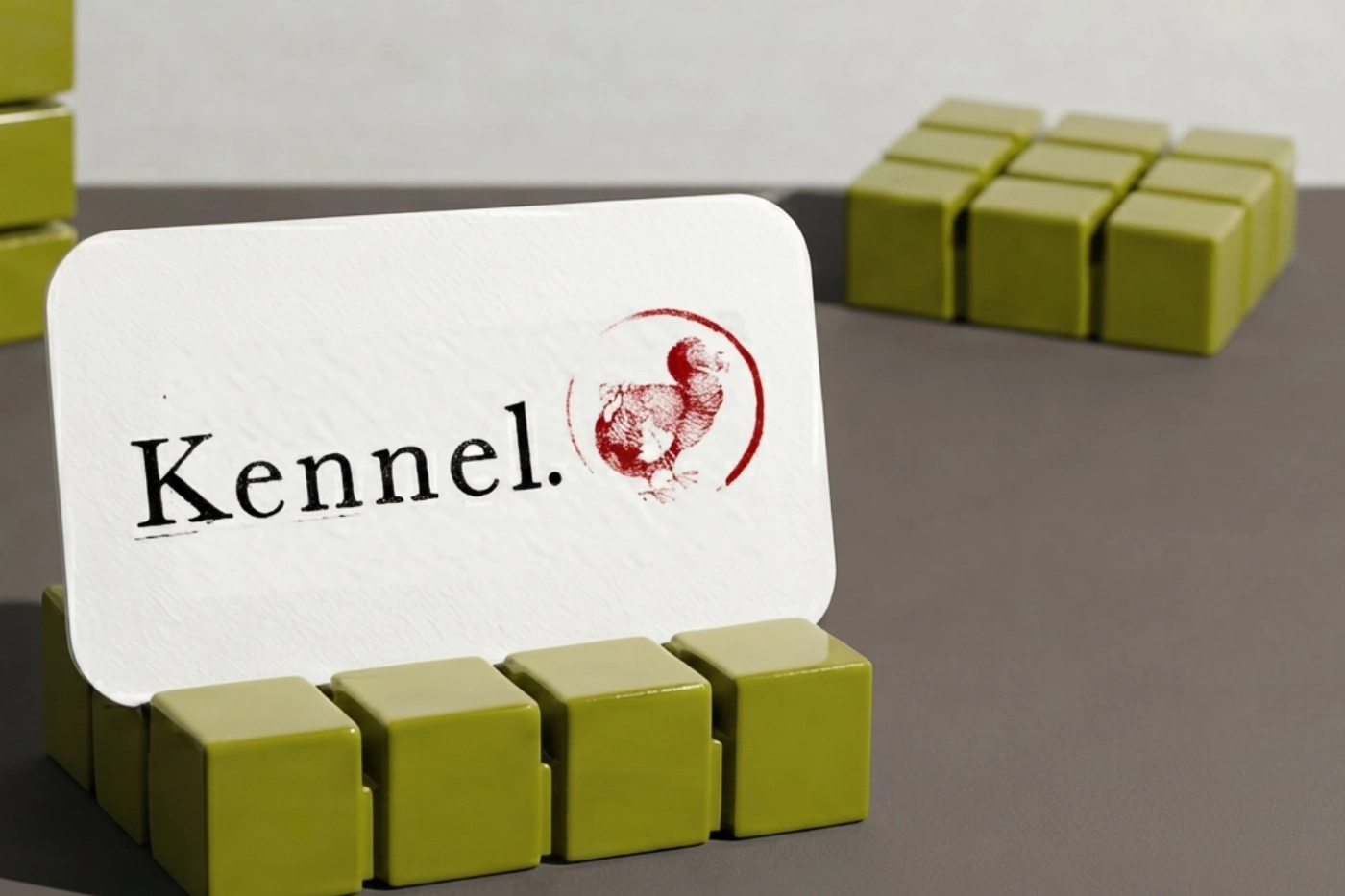
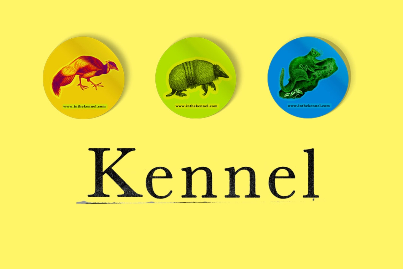
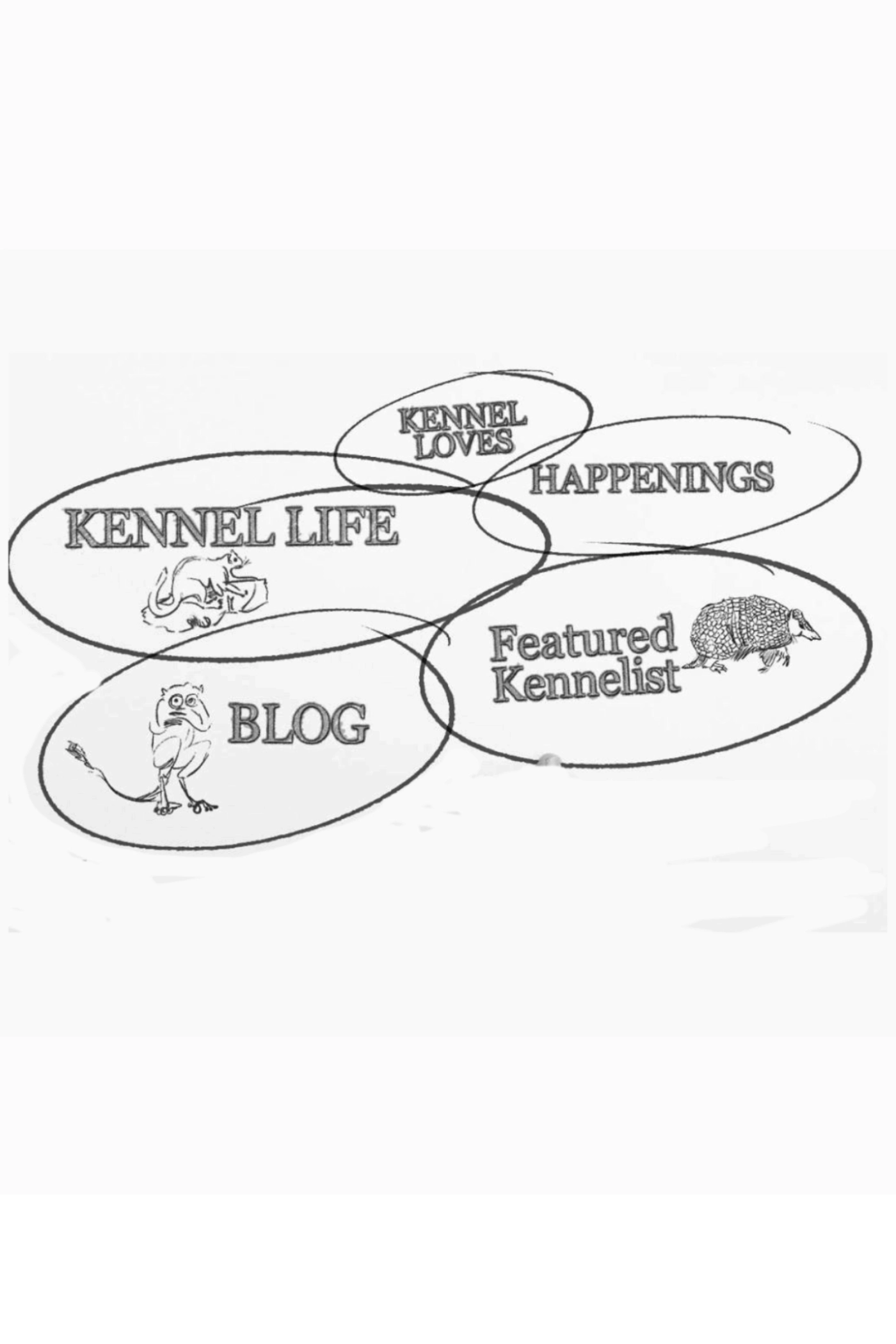
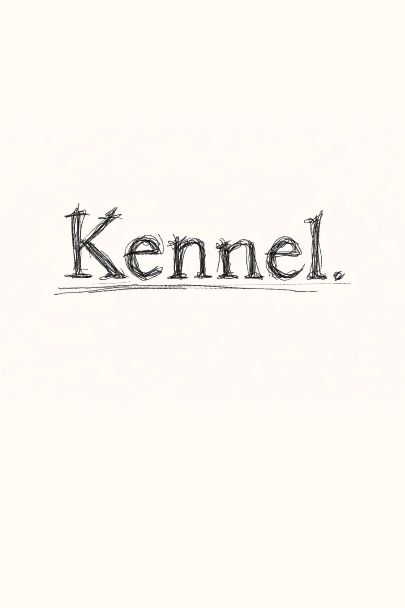
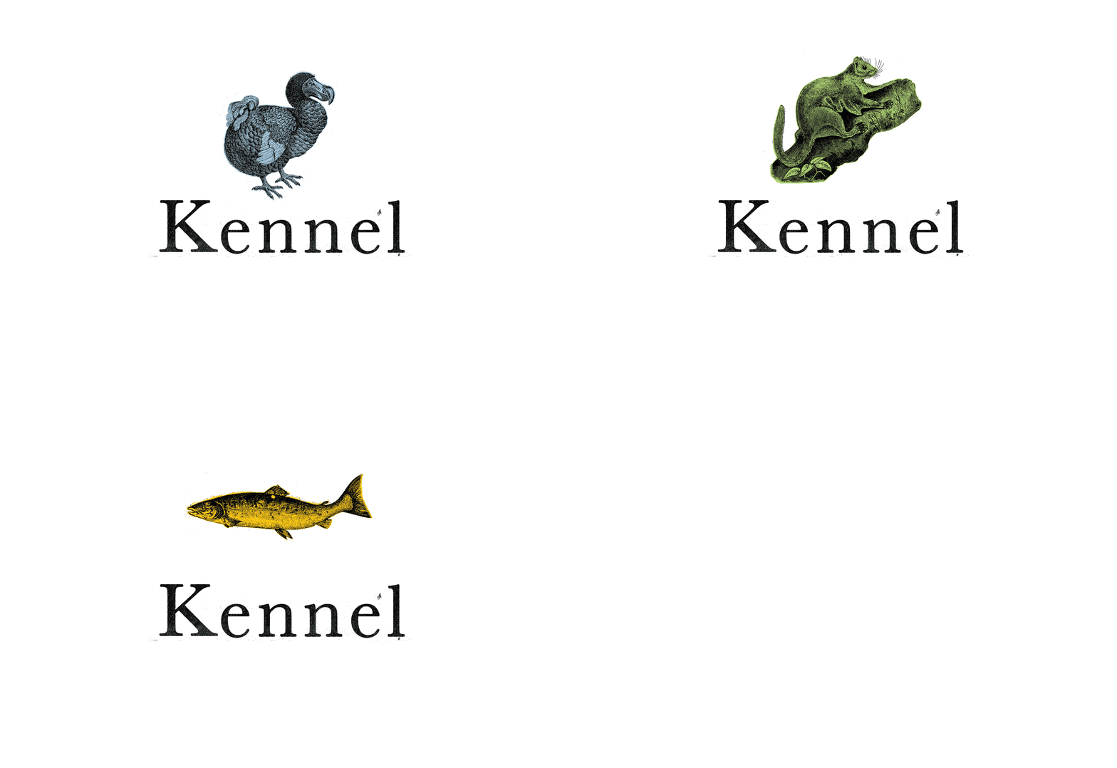
Kennel was looking for a tactile, hands-on approach—an artistic expression of the community they were building.
I started by collecting references of abstract art and typefaces, analysing the form, shape, and texture. I was particularly fond of faux fur and liked the idea of creating playful typefaces from its bristling, tactile quality. Colour and texture were elements I considered carefully when crafting the festival identity.
It had to embody the festival’s colour palette, while the choice of tactile quality became a huge feature in expressing and suggesting the abstract theme.
Time to raise the curtain
Close-up fur textures became the visual language for the festival branding, creating consistency across all touchpoints. Once we put the identity out, the responses were varied. Was it fur? What am I looking at? Human hair? Or fur from animal? We love them all. I wanted the identity to evoke a sense of curiosity and direct them to the SIFA 2016 website.
Revamped festival was widely heralded in the press, and attendance increased dramatically reaching a record 155,000 in 2016. All the possibilities. The Potentialities.